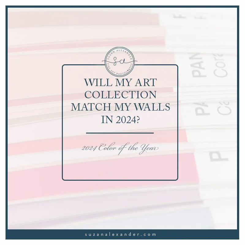
DOES MY ART MATCH YOUR 2024 WALLS?
PREDICTED COLOR TRENDS FOR 2024

Did you know that the color experts at Pantone®, have been selecting a Color of the Year since 1999? That is 25 years. I am late to the Color Party because I only learned about these predictions a couple of years ago.
I admit I initially dismissed the color trends primarily because I am a photographer. As an artist in the photographic medium, you pretty much work with whatever the muses gift you.
Couple that with the fact that I love a rich black-and-white photograph. Black & white photos are timeless images and, in my humble opinion, they are the little black dress (#LBD) of photography.
However, this year, I took notice of this predicted color trend. I even signed up to be notified when the announcement was rolled out. Why you might ask? Well, let’s discuss it.
So What IS a Color of the Year?
First, if you are not familiar with Pantone®, they are the company that is responsible for the color system synonymous with the industry standard for color customization. The purpose of this standard is to achieve color consistency throughout the different color spaces.
Therefore, their color system is used as a tool to control color consistency across various industries such as graphic design, fashion, home decor…
As you might imagine, their selected Color of the Year shows up in various ways and places you might not even be aware of - yet.
Envato produced a “History of Pantone Color of the Year” video that I found insightful, or maybe it just appealed to my sense of nostalgia. In any case, the video records how the colors have appeared in the last 25 years. (Psst! I linked the video in the “Resources” below in case you want to watch it. )
Secondly, I learned that the “cool kids” simply refer to the Color of the Year as “COTY”. Consider that tidbit of information a bonus so you can drop that hip and happening term of coolness into your next cocktail party conversation. You’re welcome.
Color palettes as inspiratioN
Finally. After weeks of anticipating the announcement of the color for 2024, the announcement day arrived. On December 7th, the COTY for 2024 was announced, but I realized that evening that I had missed notification of the announcement even though I signed up, or at least thought I signed up for notifications. I WAS receiving their emails after all, but no invite. Full disclosure: This is not the first time an invitation got “lost in the mail”. Luckily, I have resources and I was not to be left behind, so I sussed out the information on my own so I could share it with you.
And the Color is….
Drum roll, please.

Color Swatch for hex #ffbe98
The official Color of the Year (COTY) for 2024 is Peach Fuzz 13-1023.
According to an Elle Decor article, the executive director of the Pantone Color Institute described this year’s peach hue as a “blushing orange-pink”, “nurturing”, and “warm and welcoming.”
Okay, I know I’m going to date myself here, but I have to ask. Does anyone else have a flashback to the mid-1980s vibe of pastel shades courtesy of the influence of the Miami Vice television series?
On a personal note, I had a pretty strong reaction when I saw this new color trend. I am pretty sure I donned a bridesmaid dress in a similar color back in the day. As I recall, it was NOT a good look on me. But to be fair, no bridesmaid’s dresses look good, so I’m willing to set that aside and get on board the 2024 COTY train.
Color Palettes from Photos
Just to prove how I have moved past the trauma of my bridesmaid dress incident, I selected three of my older photos that included colors similar to the Peach Fuzz color. Next, I created these three color palettes for inspiration.

Color palette from a photo of a sunset in Santa Fe, New Mexico

Color palette from a photo of a tulip
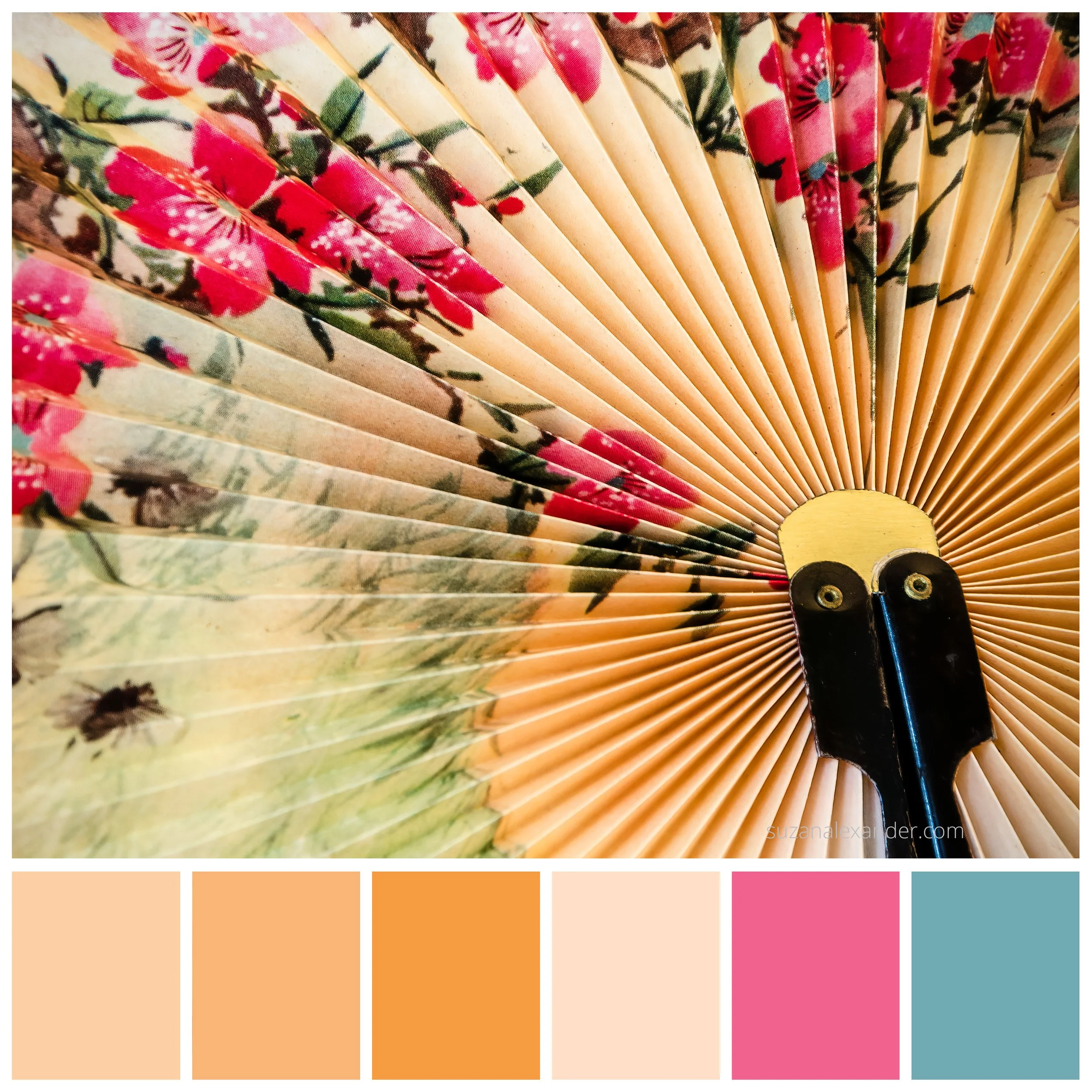
Color palette from photo of a fan detail
The Santa Fe, New Mexico sunset palette is what I would consider a neutral palette. The tulip is a lighter, almost pastel, palette. The photo of the fan detail is more of a saturated, vibrant color palette.
I think any of these color palettes might serve as color inspiration for an art project. What do you think?
How Does the 2024 COTY Look with the Little Black Dress of Photography?
“A beautiful, rich, black-and-white photograph is like the “Little Black Dress” of photography.”
As I already mentioned, I consider a really good black-and-white photo the equivalent of a little black dress in a woman’s wardrobe. If you are not familiar with the concept of the little black dress, well, it is an “essential” staple in every woman’s wardrobe. It is a must-have item that has earned its own abbreviation (“lbd”) and hashtag (#lbd).
Dare I say, “essential” is too weak. It is more of a “requirement” for every woman’s wardrobe. This required staple is often attributed to the fashion icon, Coco Chanel. You know, timeless, classic… just like a fine art black and white photo.
But, there is another reason that I think they are like the little black dress. Certain images, while beautiful in full color, lend themselves to a monochromatic process. Once the “distraction” of color is removed, the subject is somehow elevated and takes on even greater importance. This distillation of essentials reveals a new way to see the subject that, perhaps, was not as obvious with the presence of color.
I wish I could explain what it feels like to see your vision for an image manifest. To see the subject elevated to the star of the scene and reveal its story. Okay. Okay. I realize this sounds all woo-woo, artsy, and somewhat akin to Norma Desmond’s line in the movie “Sunset Boulevard” about being ready for her close-up, but hear me out.
Please do not misunderstand me. I L-O-V-E color. A lot of my work is color. BUT, I am holding firm on my little black dress statement. So let’s put our Little Black Dress of Photography to the test and see if it garners an “oh la la!” Response when we pair it with our Peach Fuzz Color of the Year. It’s a big ask, but I think our Little Black Dress of Photography can handle the challenge.

Option 1

Option 2
So, what do you think? Did our Little Black Dress of Photography meet the challenge?
Your Mission Should You Choose to Accept It…
1. Do you plan to use the 2024 Color of the Year in your decor, design, fashion,... this year? If so, let us all know in the comments. You never know where inspiration might come from.
2. I created the Little Black Dress of Photography quote that I have included in this post. You are welcome to Pin the quote to your Pinterest board. Who knows, maybe we can start an abbreviation and a hashtag just like the “other” little black dress. (And, yes. That is a joke. I did not go all Norma Desmond on you again.)
3. If you are interested in some black-and-white photography inspiration, I have a free pdf, “THE STORIES BEHIND SEVEN OF MY FAVORITE IMAGES”, as a gift when you join the “Insiders”. You can find out more information and join the “Insiders” by clicking on THIS link.

Black & White Photography Quote
RESOURCES:
Referenced Envato video: “History of the Pantone Color of the Year”
Referenced Elle Decor article: “Pantone’s 2024 Color of the Year Just Took Us All by Surprise”